
Motel One is Europe’s leading budget-design hotel brand, known for combining prime city-centre locations, stylish interiors, and affordable prices. With more than 90 hotels across major cities, the brand built a loyal following by making design accessible to a broad audience and substantially shape the budget-design category.
STATUS
QUO


You need clarity to tell who you really are
Motel One was already delivering on its promise: good product, great service, and a loyal guest base. Yet the brand identity lacked consistency and clarity, relying too heavily on “price” as the connector. The challenge was to give the strong experience a coherent expression: shaping a clear identity that feels both reliable and inspiring.

We didn’t have to invent the experience - we needed to
reveal it.
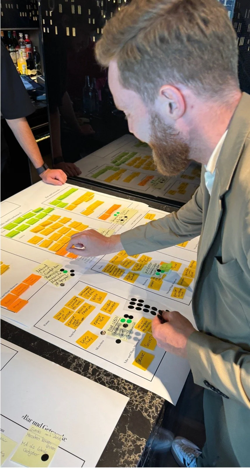
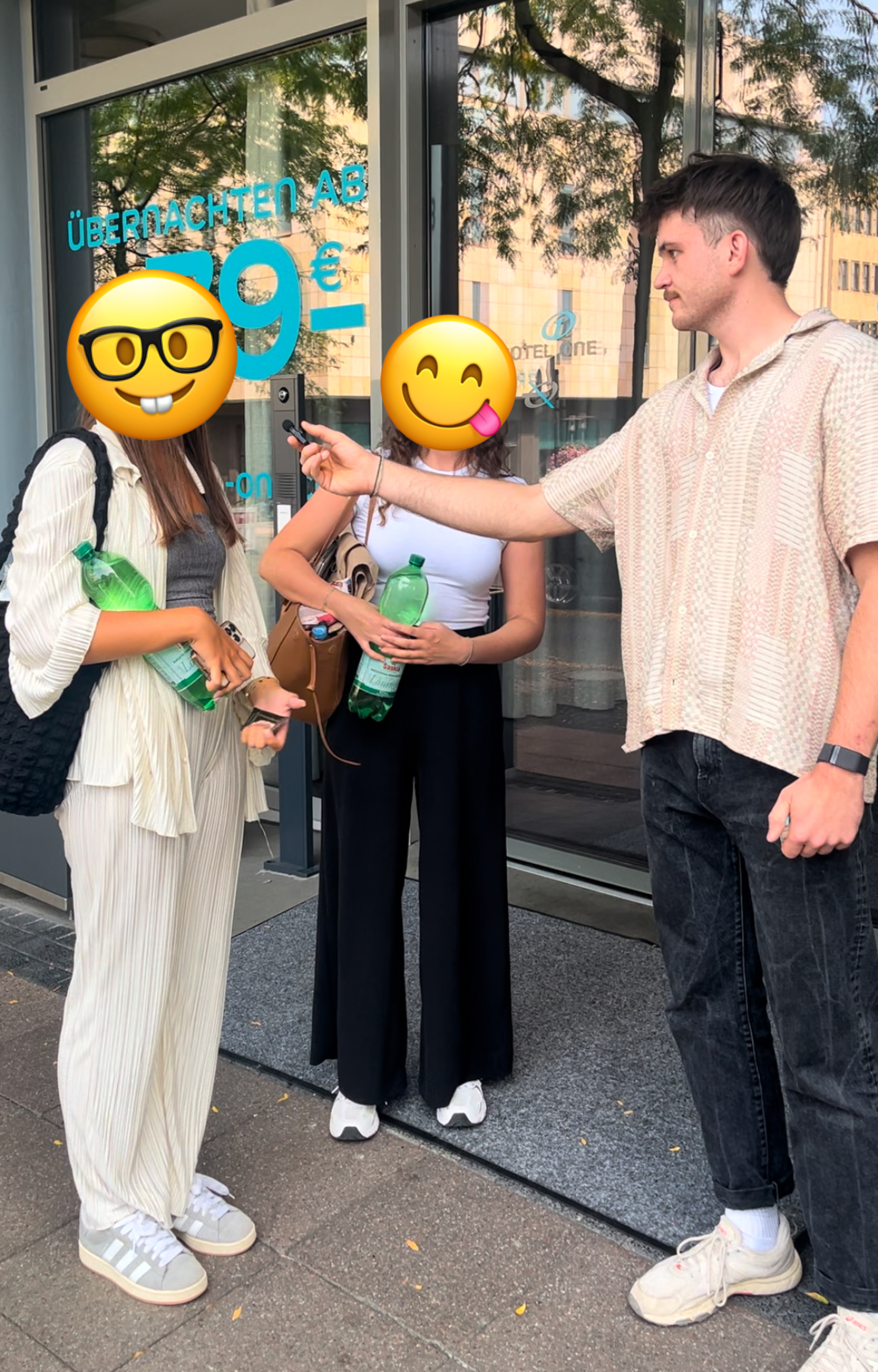
By interviewing our guests and analyzing company data we found:
Guests already valued Motel One for more than price and design. They loved the experience of staying there.
The brand was just missing clarity: Making this experience visible and tangible.
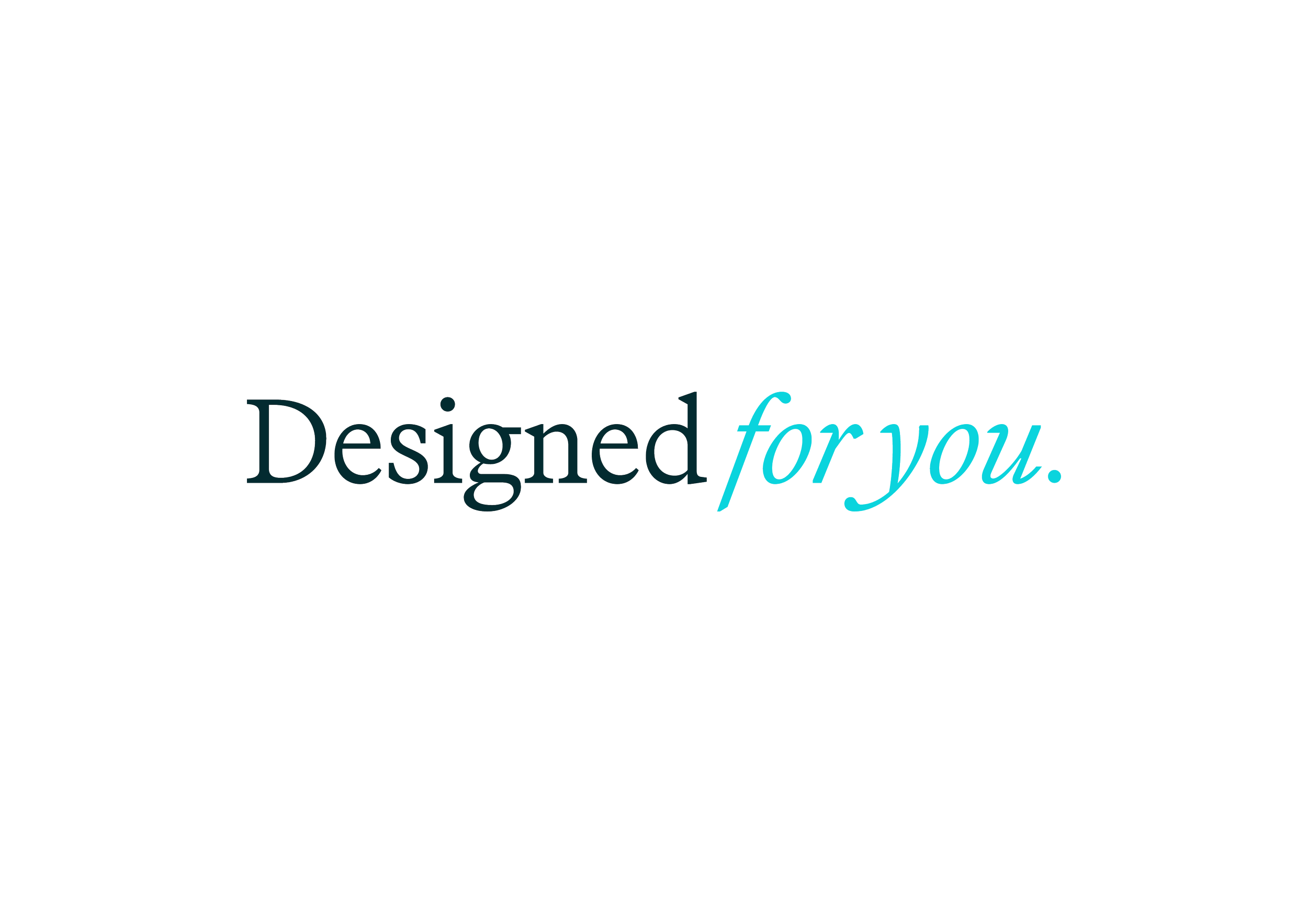
The true insight was simple yet powerful:
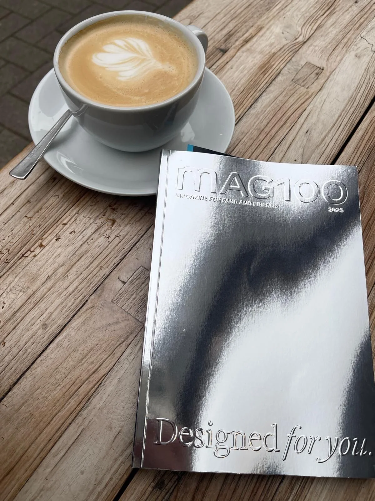
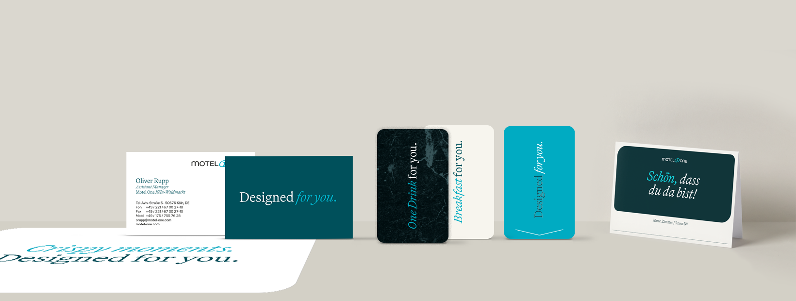
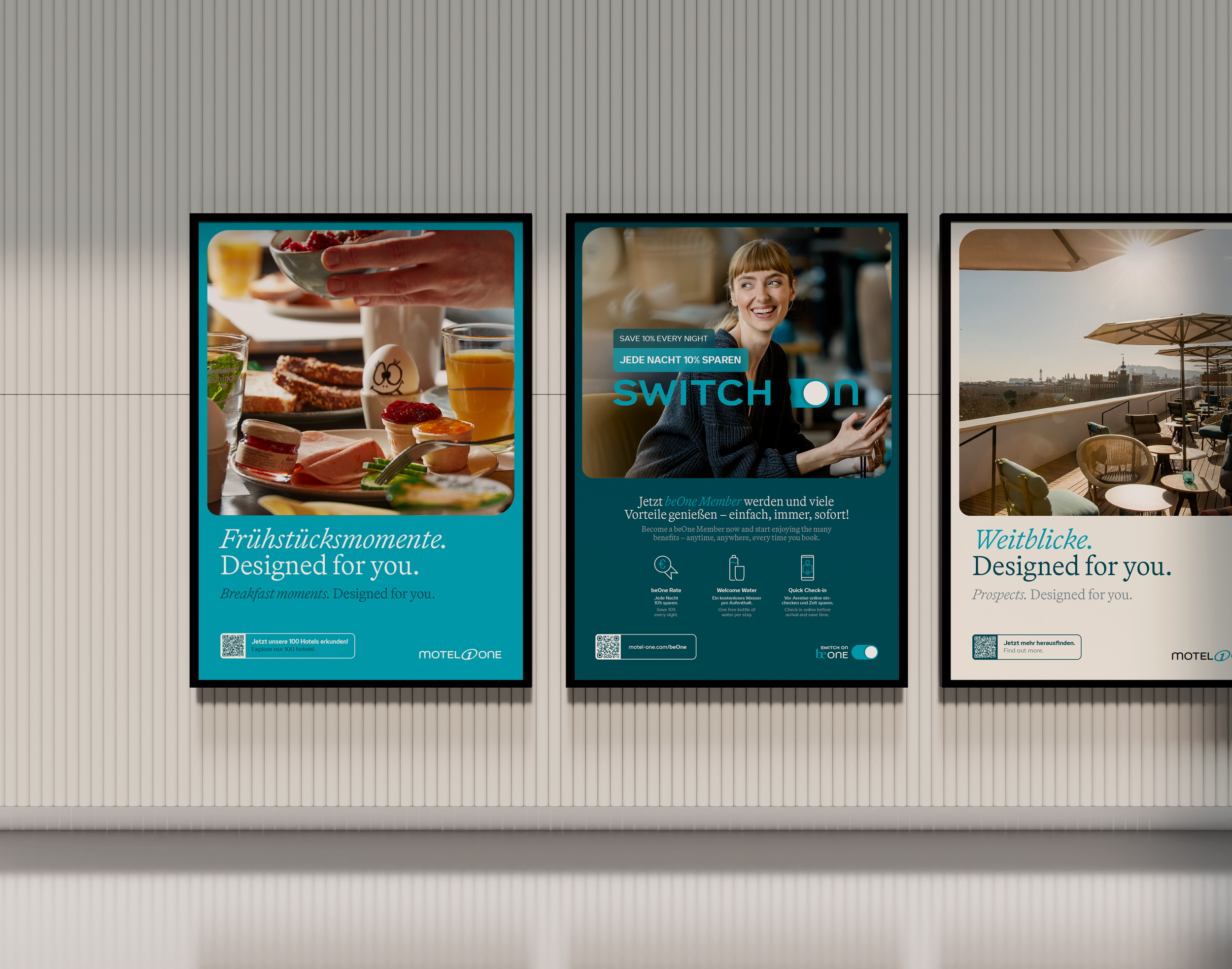
All we do is designed for you.

The key:
Natural evolution
of the brand
The idea was not to reinvent Motel One, but to make its natural evolution visible.
We built on what guests already loved: reliable design, fair price, and authentic experiences. We shaped them into a clear brand promise: welcoming, consistent and always …

“Designed” captures what Motel One has always stood for: prime locations, thoughtful amenities and fair price. The solid foundation that makes every stay effortless.

“for you” adds the human dimension: service, loyalty, and comfort that transform a good stay into a memorable experience for the guest.
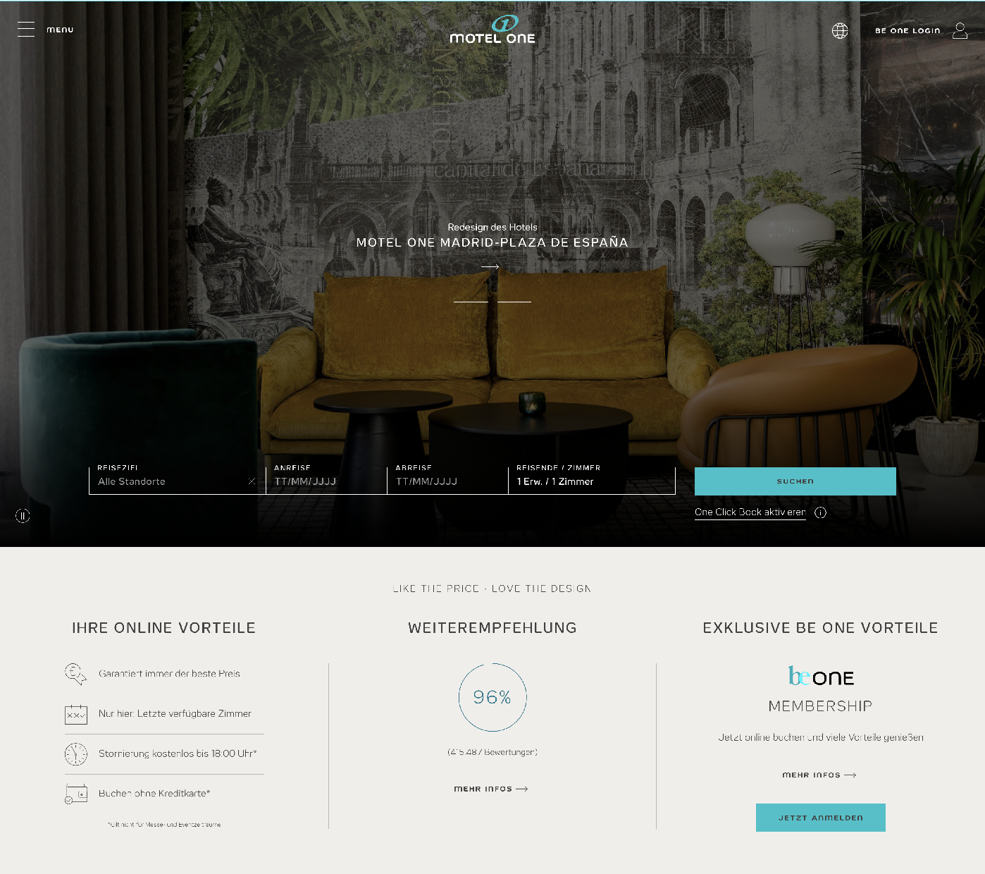
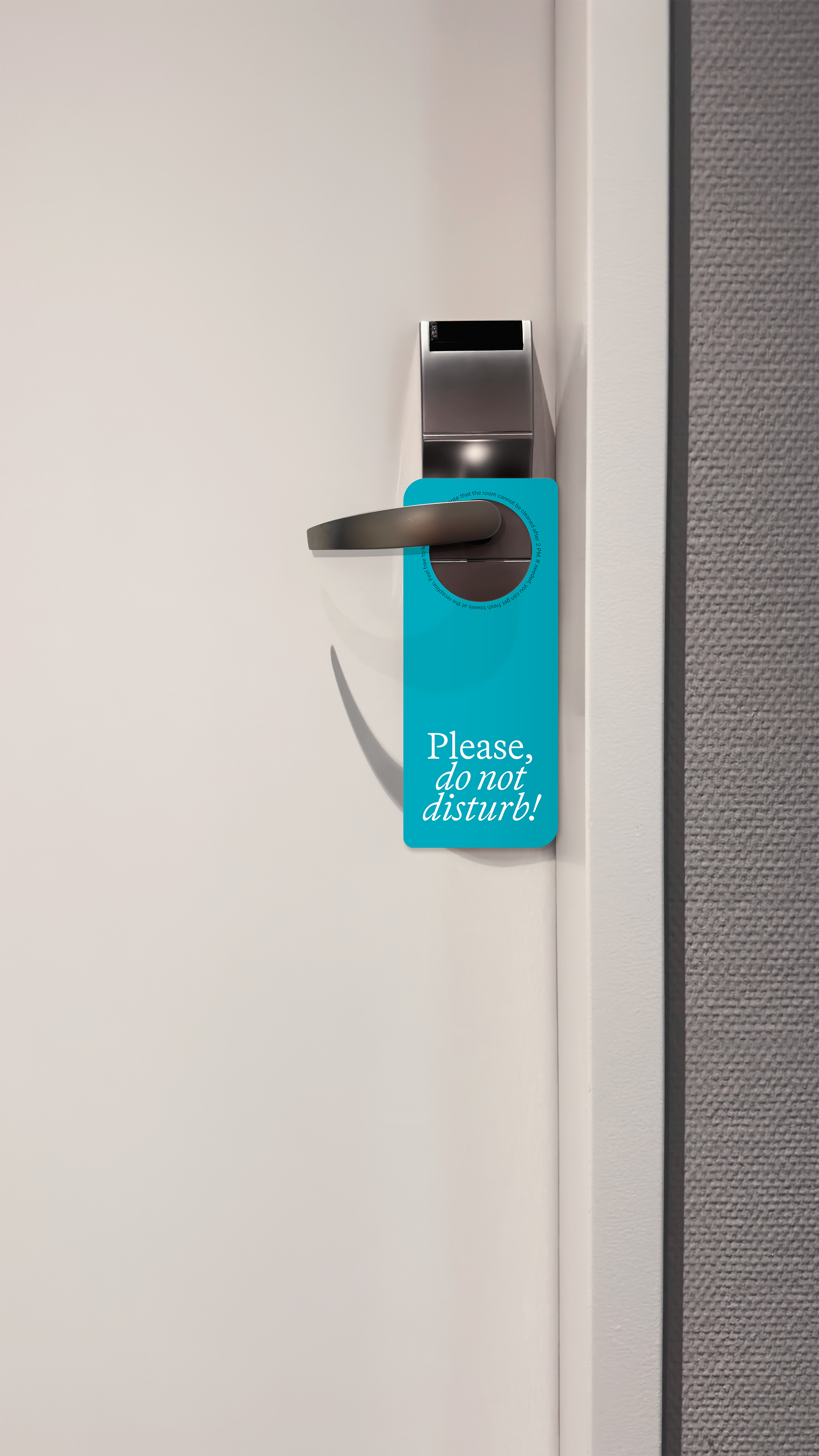
Our design principles focus on consistency while highlighting the guest, enriched by conscious contrasts and emotional warmth.
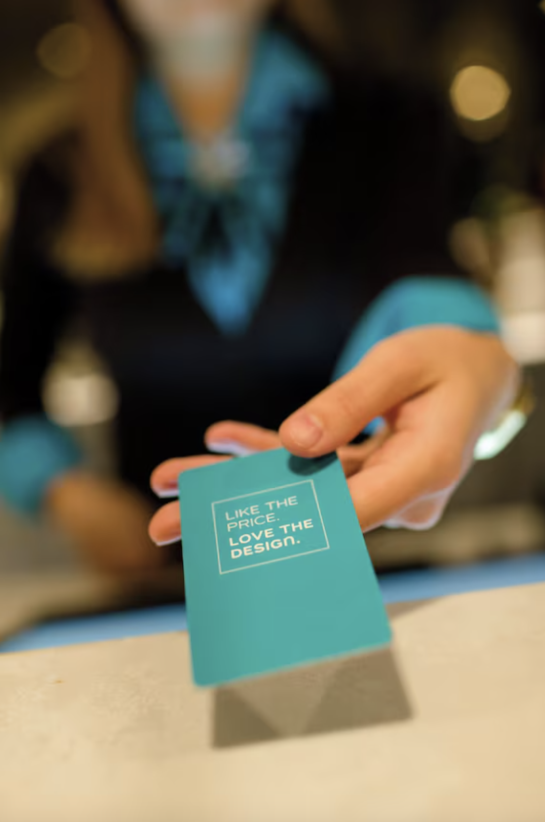
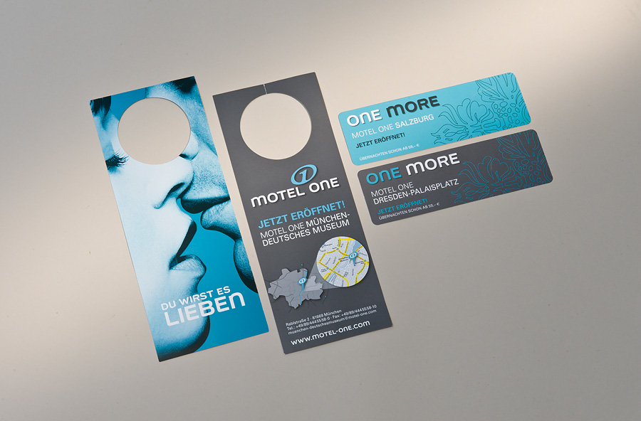
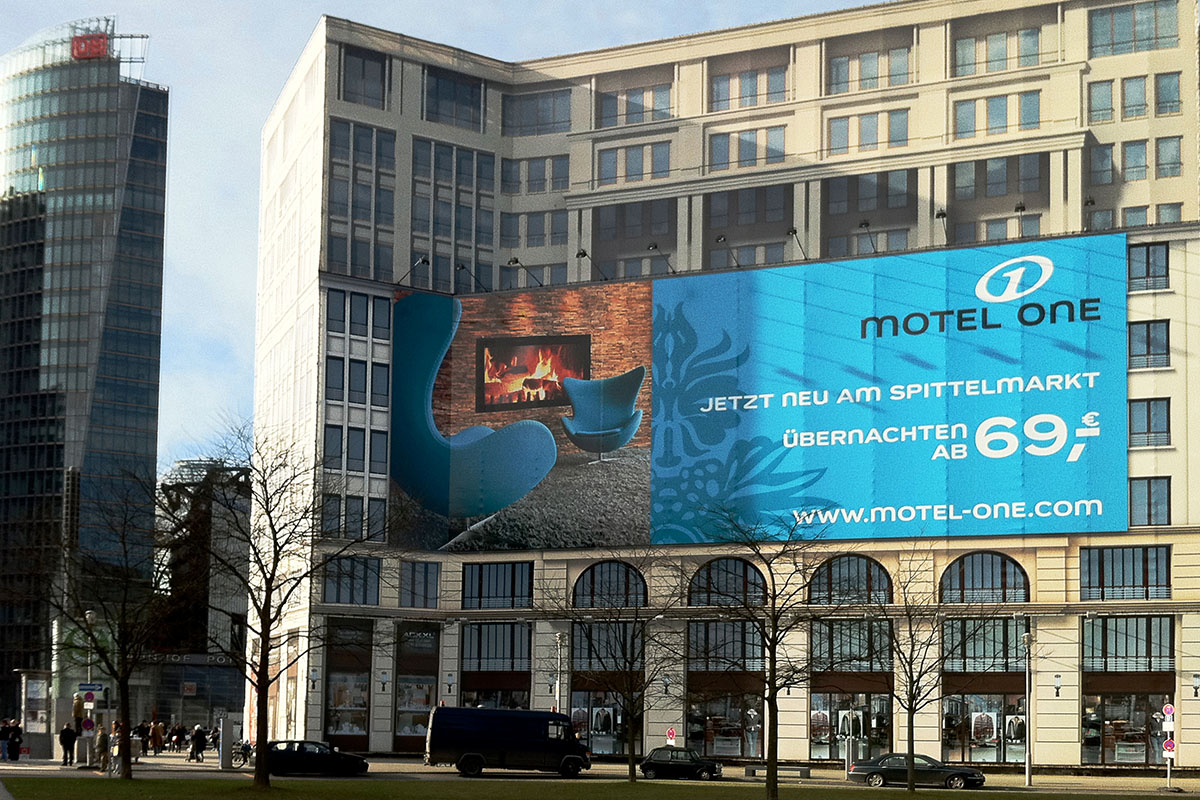
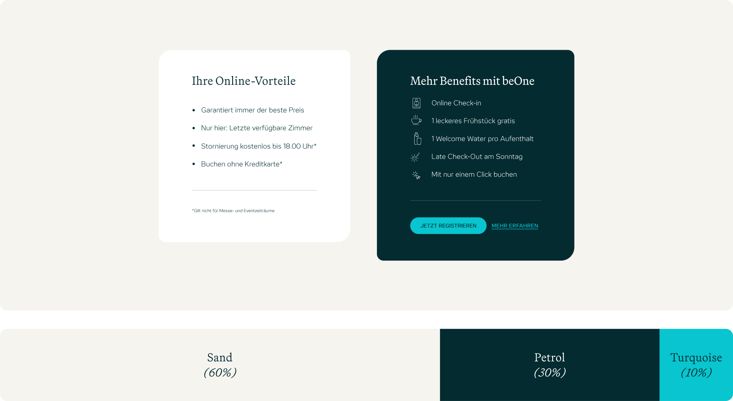
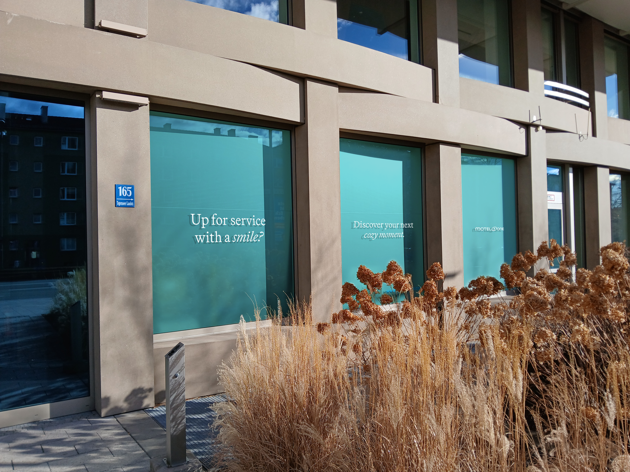
COLOURSWe detached turquoise from price communication and defined it as the brand’s anchor, ensuring recognition across all touchpoints, contrasted by petrol and softened with the warmth of sand.
photography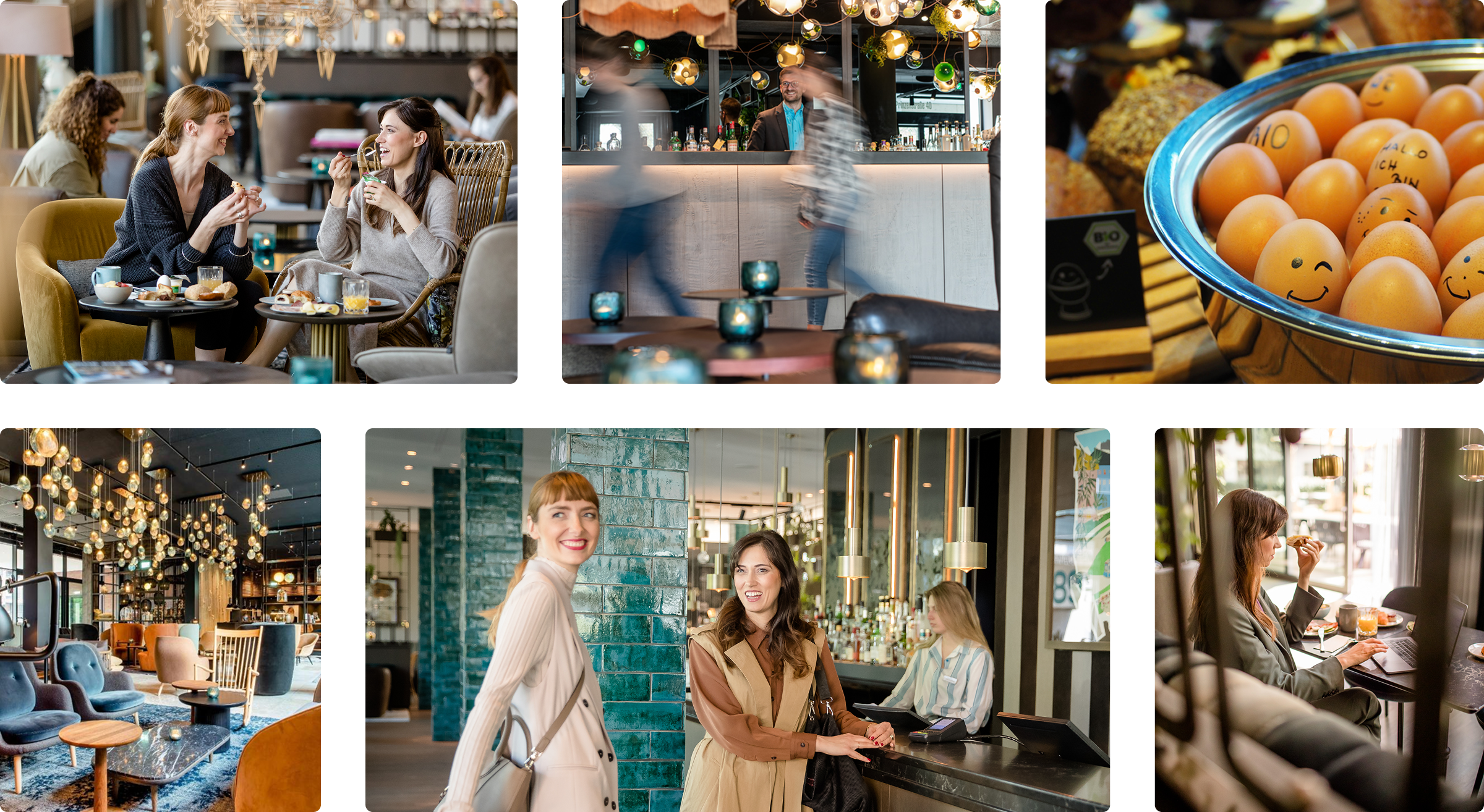
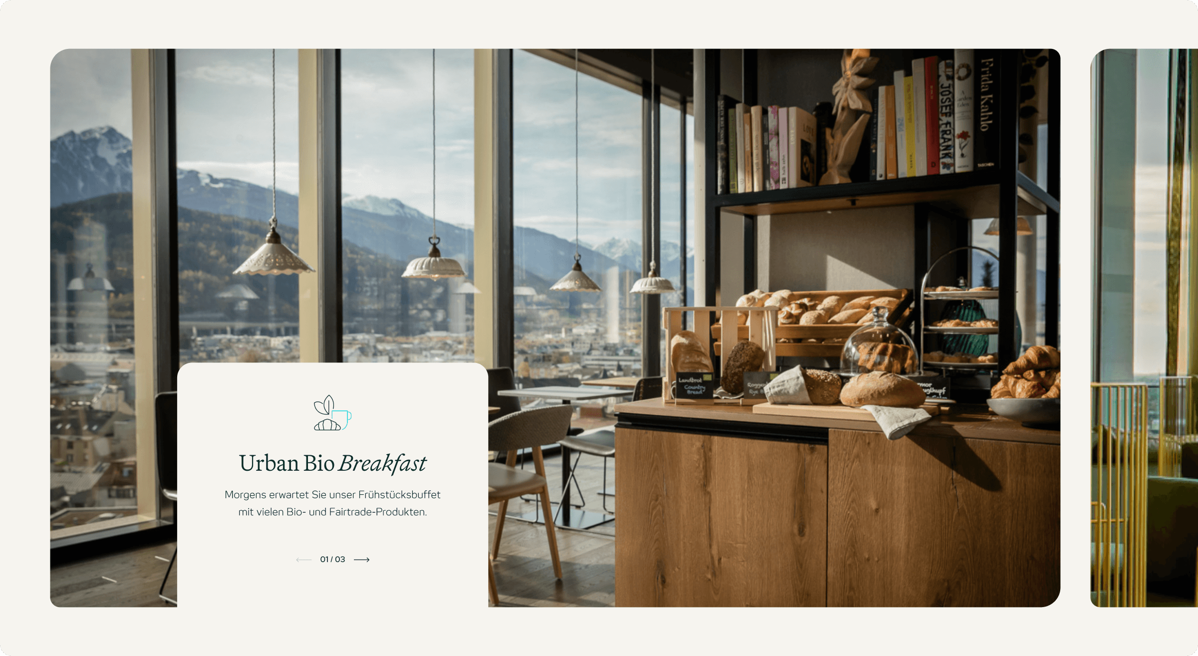
Imagery was redefined to put people, not just interiors, at the center. Authentic moments of connection now highlight the brand’s warmth and guest focus.
FONTS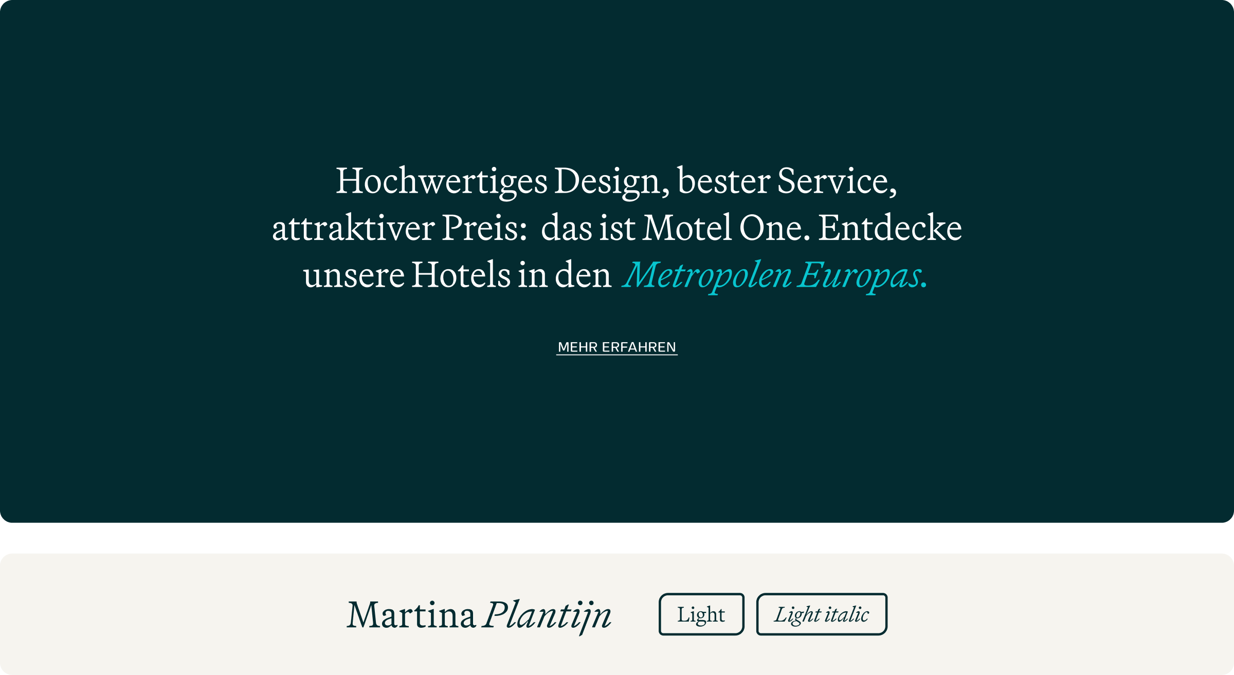
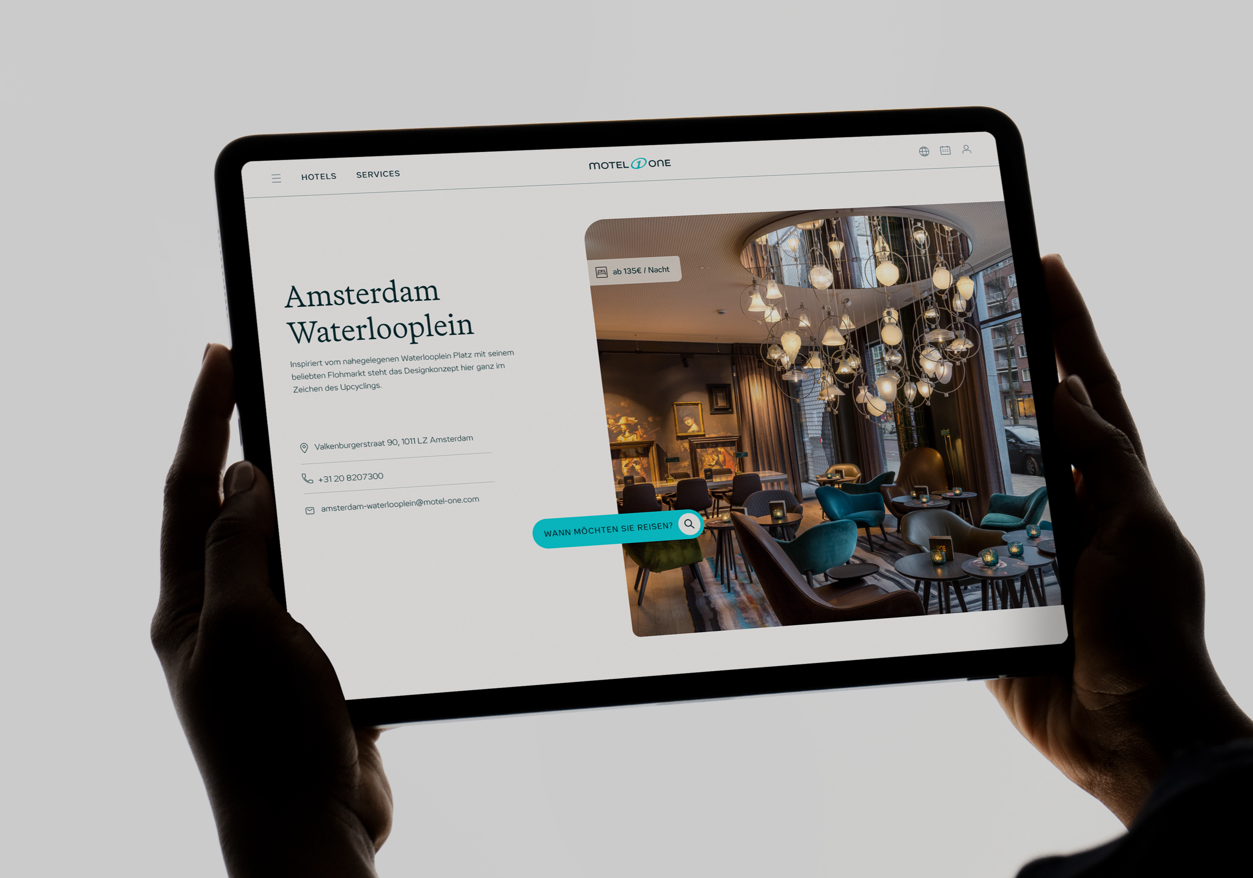
The new brand typeface shapes headlines with elegance and timelessness, creates clear hierarchy, and emphasizes key content through its italic style.
TONE OF VOICE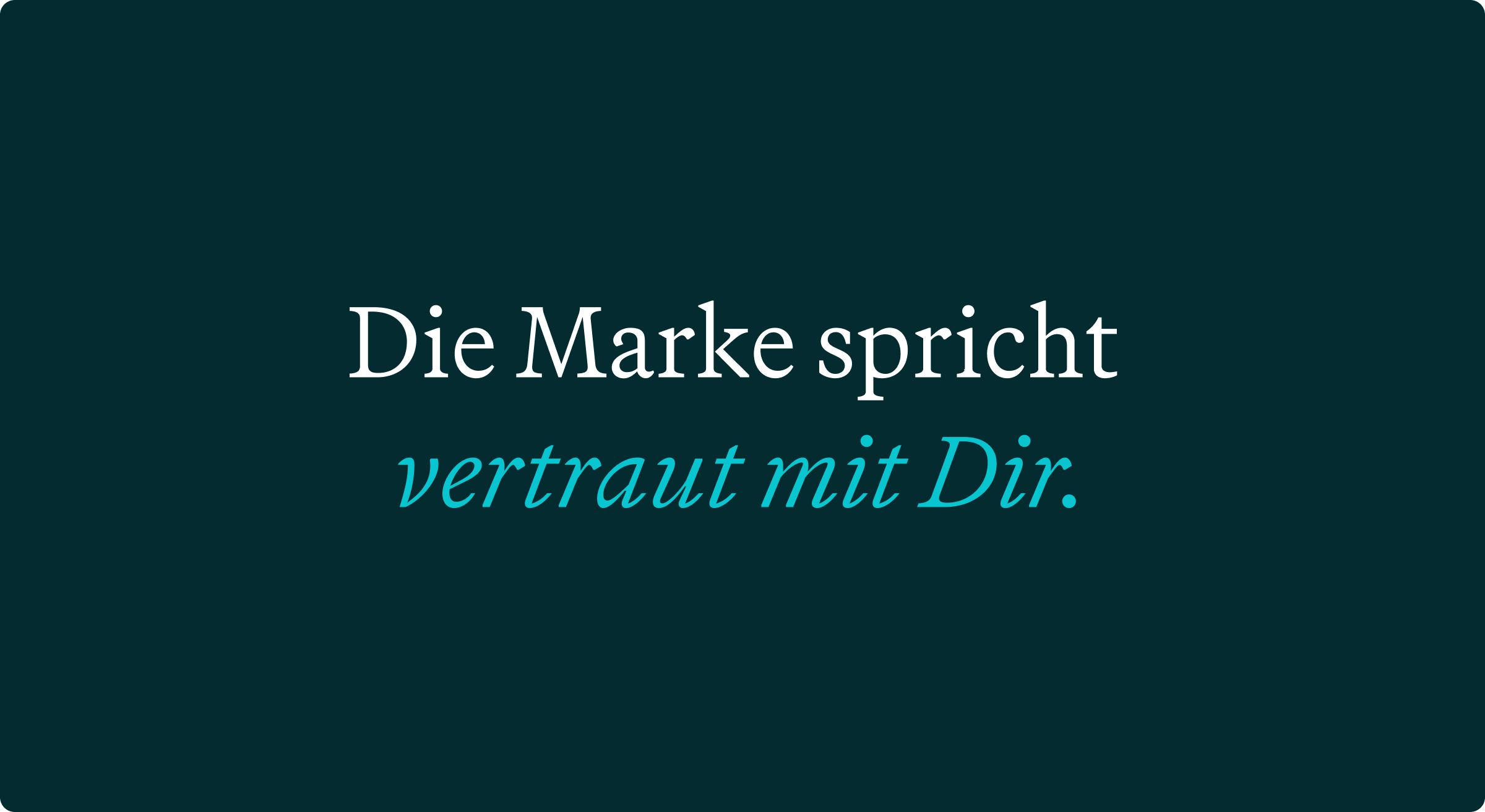
The brand language moved from formal “Sie” to informal “Du.” This shift fosters closeness, reflecting Motel One’s cosmopolitan, guest-centric spirit.
SHAPE LANGUAGE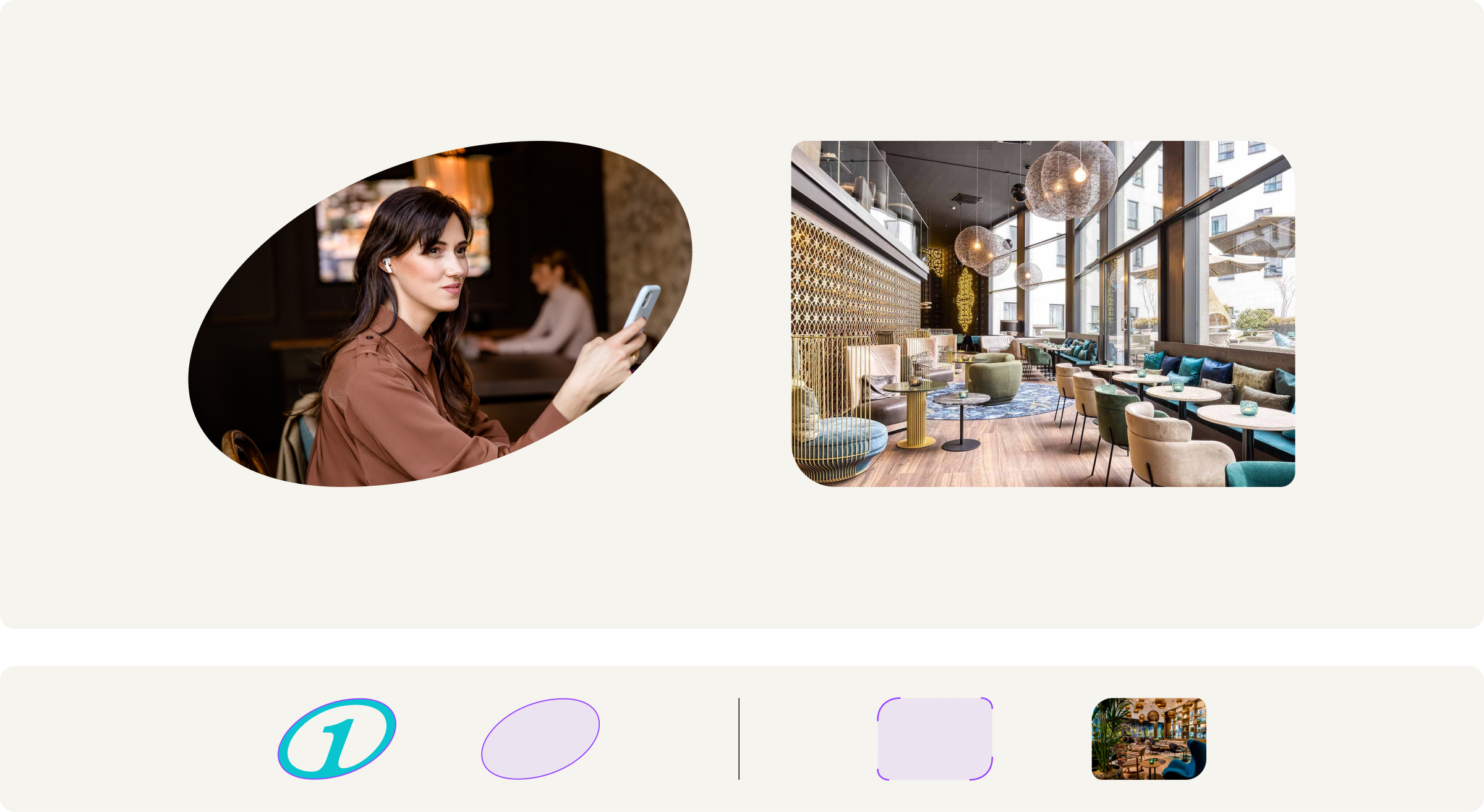
Guided by the logo and interior design, asynchronously rounded shapes became a unifying principle, infusing the brand with softness, comfort and approachability.
pictogramsDuotone icons enhance the functional system through subtle contrasts, with turquoise highlights providing a defining brand accent.

From booking
to check-out:
One consistent
journey.
The positioning was brought into every detail: an evolved design language balancing premium comfort and urban playfulness, a fresh tone of voice that speaks eye-level with guests. All with the holistic guest journey in mind: From booking to check-out.

More than a refresh:
A platform for the future.
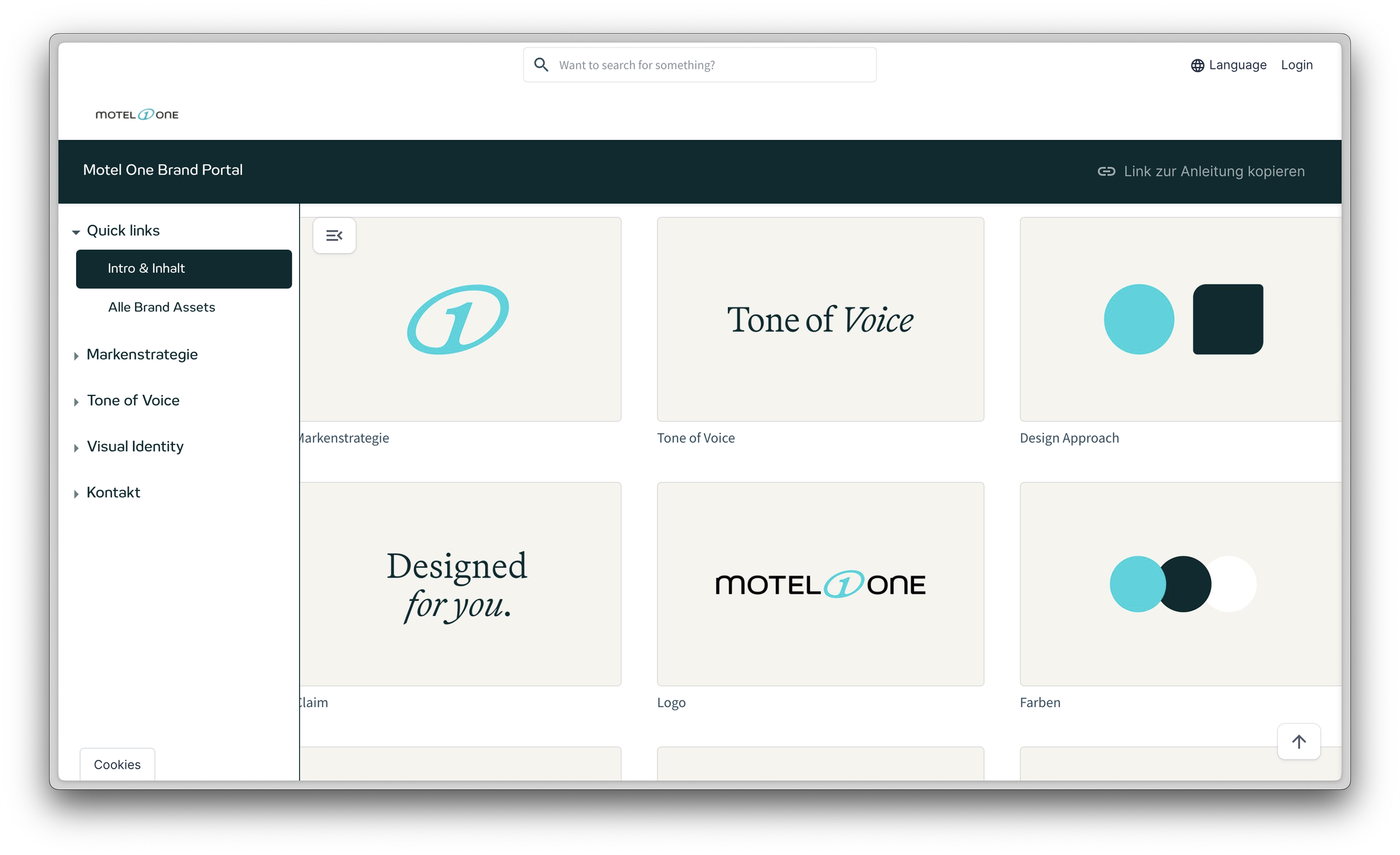
With the refresh we established a scalable brand platform that ensures consistency across every channel and location. By embedding the new guidelines into a digital brand management system, Motel One empowered teams worldwide to work seamlessly with the refreshed identity.
The result: A brand that is not only more human and relevant today, but also equipped with the tools to grow consistently and confidently into the future.
+90 Hotels onboarded
More than 90 hotels have been adapted to the new design within 3 months.
x2 Increase in loyalty program signups
Signup rate for Motel Ones loyalty program doubled since the launch of the new brand.
